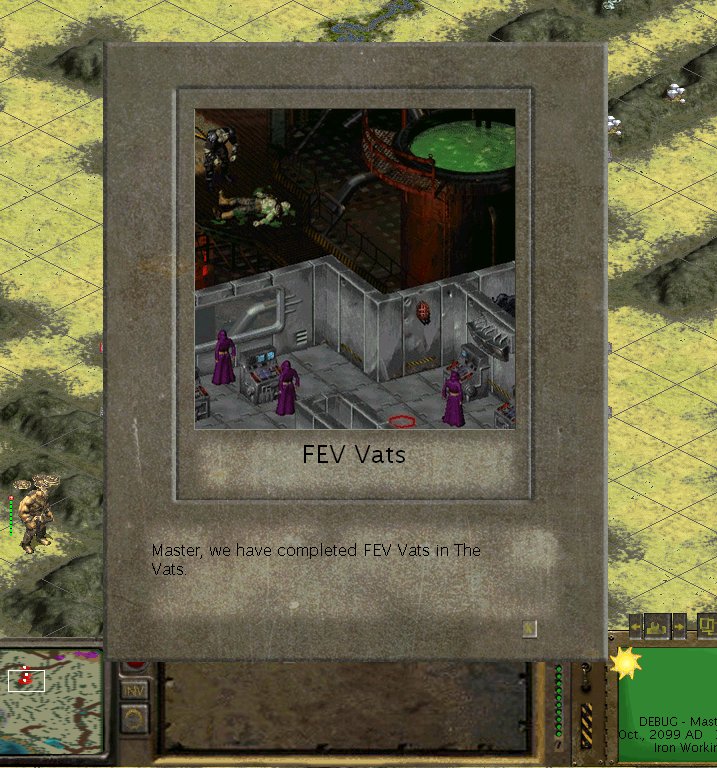
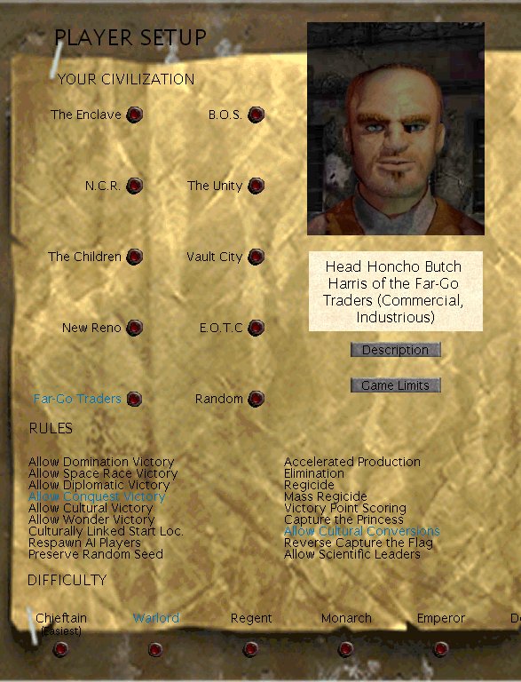
You mean like my rearrangement?PiP wrote:It'd be less confusing for some khm khm members if you put the pictures in the right order dude. Also it'd be nice if they were equally scaled.
I like the rusty one more, but in this small screen some details look too blurred because of the new background - rusty is good but make it legible and so easy to use.
The loss of detail was due to the reduction and jpg format. It is as clear as the first one. Only thing changed so far was the background layer.
Cheers, Thorgrimm


