Page 1 of 5
the cover art poll
Posted: Fri Oct 13, 2006 4:53 pm
by PiP
Posted: Fri Oct 13, 2006 4:57 pm
by PiP
Posted: Fri Oct 13, 2006 5:10 pm
by atoga
the general quality is okay, a bit generic and fantasyesque maybe. it doesn't really do anything for me. if the obvious queues weren't there (power armor, vault suit) then i'd have no idea that it was a piece of fallout art. where's the wasteland at? all i see is a hazy background and some artillery.
perhaps they should just say fuck cover art altogether, and make a cover that looks like the fallout 1 manual. leather-bound minimalist survival guide. my friend made something like that & drew a pipboy over that for when i printed & bound my fallout pnp manual; it took him like five minutes to make and it was pretty.
so either do something simple like that or take the high road of making something which has a clear '50s influence. it wouldn't be that hard to make. admittedly, the comic book art from the loading screens of fallout isn't even that good; i could easily paint something like that. the point is that it's pulpy and fitting.
i remember hearing that the logo there was just a tentative one, so hopefully they'll have something presentable in the future.
geez. get your sense of aesthetics right, gluttoncreeper. graphic design is not that hard.
Posted: Fri Oct 13, 2006 5:23 pm
by Baby arm's evil twin
I voted "it looks like CRAP and it's totally NOT Fallout style!". I would have voted "the general quality is Ok, but it's definitely not Fallout style" but really the ghoul and mutant don’t even resemble a ghoul and mutant. The only reason I know what they are is because I don't think GCG is dumb enough to try to make a fallout game with Orks and Mummies. The art talent may be okay as art, but it doesn’t even come close to being okay as an illustration to a licensed fallout product.
I really hope that GCG takes this poll seriously and reconsiders the validity and effectiveness of the self-righteous attitude they have had thus far. They may even want to consider delegating one person to be the PR guy (the front man) to be the only guy who speaks for GCG in the hopes that it might improve both their image and relationship with the fan base of the product they are trying to sell.
Seriously GCG… regain the support of this community and make a good product and you will be very successful. Keep telling your potential customers that they are fanatics who have no clue about art or tabletop games or anything for that matter and you will sink fast.
Posted: Fri Oct 13, 2006 7:21 pm
by PiP
I must disagree with you atoga; in my view the art is generally very poor. This
airbrush technique (or whatever) makes it look like spray-painted
graffiti and a very
non-professional one. GCG guys, if you read this: I don't say it out of bitter anger; I've calmly thought this over and I mean it.
The
way it is painted, especially the woman, resembles a style that's made
by teen girls, for teen girls (I've just made a Fd20 slogan

, all rights reserved!). This
teenage-style badassness is, sadly, pathetic and bathetic.
And again, I'm not trying to find something to bash to please myself; I'm concerned with Fallout games and this art is
screaming it's
wrong. I wouldn't bother to post all this if it were unimportant little details.
There's also the
font, which is
not Fallout and feels
not 50ish. If I'm wrong, of which I'm very doubtful in this case, prove it.
Finally the whole concept of making this sort of
layout/composition has little to do with irony/minimalism(as in Fallout manual)/50s_style/anything decent. On the contrary, this
accumulation of badass elements looks like a poster for some stupid hollywood action flick, and combined with
fuzzy painting, funny colours, and rounded edges (like the helmet's sight aperture

) it's like
second-rate fantasy action-RPG fan art.
Apart from all the afore mentioned there's also a serious issue with the
content; the worst for me are the looks of the mutant and ghoul (is it a ghoul?); vault suit is completely not right, and the guns are not held properly - akimbo pistols and minigun held by the mutant.
I hope it's not too late to make another cover and I hope the rest of art is much better, for I still hope there's a chance Fallout d20 can be at least decent. Can it, GCG?
Posted: Fri Oct 13, 2006 7:29 pm
by Ausir
Baby arm's evil twin wrote:
I really hope that GCG takes this poll seriously and reconsiders the validity and effectiveness of the self-righteous attitude they have had thus far. They may even want to consider delegating one person to be the PR guy (the front man) to be the only guy who speaks for GCG in the hopes that it might improve both their image and relationship with the fan base of the product they are trying to sell.
The problem is, apart from freelance artists and designers, GCG *IS* only one guy.
Posted: Fri Oct 13, 2006 7:47 pm
by Aneurysm
I can see this was based on fobos...
Posted: Fri Oct 13, 2006 8:25 pm
by Brahmaparash
I think that's amateur art, really amateur art... I remember the time I played Fallout 1-2 - I was at school at that time, and some of my more talented classmates, under the influence of the game, used to draw pictures like the one above.
To do a 50-s style cover you have to be a professional and you have to have a whole team of artists to produce quility images (and this guy was working alone, right?). Take a look at Games Workshop with their Warhammer series and stuff - they have several dozen (if not hundreds) artist - they have the time and the resources to think about style and the feeling their art invokes. GCG is on a different level. You can't blame a man for not having a talent or a sense of style.
Posted: Fri Oct 13, 2006 8:32 pm
by PiP
Brahmaparash wrote:To do a 50-s style cover you have to be a professional and you have to have a whole team of artists to produce quility images (and this guy was working alone, right?).
unfortunately
Fallout d20 artist wrote:Yopu know what, All the artists worked their asses off, and if wanna judge a book by it's cover then fine, don't buy the fucking thing, I don't want my artwork in your hand if that's the case.
I agree it's not the best cover, but I've seen far worse from bigger companies.
And if you say we artists didn't take this seriously you can go fuck yourself. I worked my fucking ass off to do the best artwork I've ever done and I won't fucking take it from some nitpicking fanboy who wouldn't know his his ass from a hole in the ground. I've very proud of ALL the artists. Every single fucking one of them, and I'll defend their work to anyone who come along. And I'd be honored to work with them again.
Fuck you
(
he was
mad because Rosh bashed him, and you know the way Rosh bashes..)
Posted: Fri Oct 13, 2006 8:41 pm
by atoga
i agree with you pip, the art is fairly amateurish and it certainly has some irreconcilable differences with the well-estableshed fallout canon style. it looks like fan art. i don't really want to shit all over it because i think it's okay in itself, and for the most part i do like the work of the artists involved in the project
my point is that not much is required of the cover art. most d20 products, especially the indie ones, don't have cover art at all. i think the minimalist style of text-on-faux-leather would probably be best, as long as it remains consistent with the fallout aesthetic.
this is an indie book, how many people are going buy it? a few thousand, at the very most? certainlly people aren't going to buy it for the cover art in the first place, nor are they going to buy it if they're interested in post-apoc stuff (there are enough settings that already do that, and are way more established than fallout is). they're going to buy it because they know the fallout name, which is why i think the current outlandish cover art doesn't serve much of a purpose.
Posted: Fri Oct 13, 2006 9:35 pm
by Rosh
Amusing! They have their own moronic apologists already!
Rakkasan240B wrote:
There is nothing GCG, Bethsoft, or any other entity on this planet could do that would ever make this group happy. If the entire team from Fallout 1 got back together to make a new Fallout PC game, people would still complain. The Fallout "fan community" (which in no way speaks for all Fallout fans, despite their personal beliefs to the contrary) exists for one purpose and that is to complain. It's the nature of super-fan groups, so if I were you guys, I'd stop trying to get anyone to take you seriously or even listen to you since there is absolutely no incentive for any game company (table top or PC) to ever attempt to cater to you. All you guys accomplish is hurting the credibility of the rest of the fan base and we don't appreciate it (not that you care).
Anyway, flame on.
No, we don't like it because it doesn't even
try. If people decided to make something that fits the setting, styles, and the gameplay of the game, then we wouldn't have anything bad to say about the material. Simple, common sense, that the simple, common morons like that don't understand.
Problem is, which people like this are too stupid to understand, nobody has bothered to keep to those styles since Fallout. So OF COURSE we're not happy with anything that deviates from that, and until we get what we do want, don't see any reason to honor shit merchants or the assminers defending them. Their hyperbole in light of Fallout history just makes them into a bigger sack of shit for defending incompetence so weakly.
Brahmaparash wrote:To do a 50-s style cover you have to be a professional
Well, I amusingly note that a commercial product should have people with some inclination to work in a professional capacity.
and you have to have a whole team of artists to produce quility images
No.
Want a look at a real professional who does have a clue about period styles? It certainly isn't any of the kiddies at GC.
GC's just simply unprofessional on every level, from the editing and general writing composition that makes high school newspapers look quality, to the art made proficient from wasting time in school because the artists obviously didn't have a fucking clue of the proper styles.
Ausir wrote:
The problem is, apart from freelance artists and designers, GCG *IS* only one guy.
Herve's concubine? Or
another small junior high school kid we're probably going to hear about being found in their basement, softly mewling like a kitten in denial.
Posted: Fri Oct 13, 2006 9:54 pm
by Baby arm's evil twin
<side>
Rosh
I think it's time to change your sig.
Posted: Fri Oct 13, 2006 10:01 pm
by Rosh
Done, how's that?

Posted: Fri Oct 13, 2006 10:04 pm
by Baby arm's evil twin
Jesus would approve.
Posted: Fri Oct 13, 2006 10:09 pm
by PiP
Posted: Fri Oct 13, 2006 10:27 pm
by Rosh
On top of this, here's the most amusing part,
yet another version of lies and excuses has surfaced, making about three so far with Tensen01's "we're being original because it would be stupid to re-use in-game art" idiocy, then GC's own "They are along 50's styles" blatant lies (then locks the thread containing those lies like a total coward), to Craig Peterson's "It was made more towards a Mad Max movie poster", which is the answer I was looking for because it was such an obvious rip-off of the Mad Max movie poster art. Then the dipshit decides to make ill and clueless comments about the original Fallout styles as reason to deviate from them.
Okay guys, just relax for a sec. You've seen one sample of artwork that GCG put out to let fans see how we were progressing with the project.
I worked on some Vault Boy and character pics for the d20 book and I can tell you that I tried to inject as many 50's references into my artwork as I could. You will have to wait until the book is published and see all the artwork to judge whether we have adhered to the "Fallout style". Over the course of all our work, I believe we have.
As you know, Fallout is a blend of both Mad Max and 50's sci-fi. The cover is obviously leaning more towards the Mad Max (post-apocalypse) side of things. That's all there is to it. We were trying to create a movie poster feel to the cover artwork and I think this was achieved very successfully.
The original Fallout art team didn't always adhere to a strict 50's sci-fi influence either. For example:
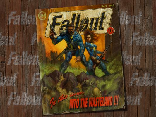
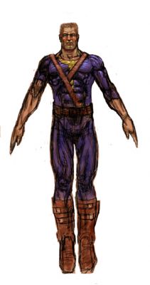
Art from Fallout. I love this pic but, let's be honest, their Vault Suits look like superhero costumes and nothing like what people would have worn in a 50's sci-fi movie, like this from
Forbidden Planet.*
Have a little faith. We've tried to stick to canon while also drawing in our own styles (so that we can create the strongest work we possibly can). Previous Fallout artists would have done exactly the same. We've critiqued each others' work and edited accordingly so that things stay as true to the Fallout games as possible.**
Just wait to see the book in its entirety before passing judgement.
Well, congratulations to whomever made a lame Mad Max rip-off poster, but now would someone care to approach Fallout's style? No, I don't mean the post-Fallout developer style of hype, lies, and bullshit you can't seem to agree upon. Mad Max was just part of the style of Fallout, but the pulpish style was far more prevalent...and is the part that's missing, along with details. You know, the details that John claimed were taken from the in-game models, but were such a blatant lie given the vault suit and other characters in the piece.
* - Rosh's note:
AGAIN, MEANT TO BE IN THE SAME STYLE AS EC COMICS, YOU UNBELIEVABLE RETARDS!!
NOT Forbidden Planet (except that is where the science robot styles were taken from). In space stations or other similar locations, the astronaut or inhabitant didn't need any loose clothing, and hence it's kept form-fitting, while the science-fiction elements (like the PA, versus a more form-fitting suit like Boba Fett) are kept bulky and purposefully intrusive, to define the line between humanity and the advances he creates to overcome his challenges whether it's from a space station to a sealab.
Again, GC and the rest seem to have no clue of the setting, as per usual, and think it's just 50's thrown in haphazardly. Oh, and I guess it's our fault for not liking their brand of cluelessness.
** - Again with this claim, you lying fucktards. Then explain why the intro, the traits, AND the art were all fucked up. Can't? Then you're incompetent AND clueless.
Posted: Fri Oct 13, 2006 10:27 pm
by atoga
here's a scan:

you get the idea.
the interior was also laid out quite nicely. century gothic was heavily used and they kept up the 'survival guide' theme very well.
i always thought the other fallout-esque boys in the fallout 2 intro looked shitty.
Posted: Fri Oct 13, 2006 11:53 pm
by Mog
Of all the sights in the world this is what drew me to the game originally, the above picture of the fallout 1 guide .I mean it brought a symolic feeling that someone had actually CARED about the world they had created about how INVOLVED the game designers were and about how much they knew future fans could get into the game knowing that they had a indepth and engrossing game.
All this fancy language aside this pic of the guide rox. It brings a good feeling to mind
Posted: Sat Oct 14, 2006 1:23 am
by Rosh
A picture says a thousand words.
Well, how about a picture and GluttonCreeper's own words?
Enjoy!
For those unable to visit to see the link, it's GC's even shittier cover image from their site to be used in comparison with the one I extracted from the PDF. With the following:
Pic Title: Fallout:POS DeeDeeDee20 Cover Pic, GluttonCrapper Edition
Pic Description: So far, there's three separate explanations:
Tensen01 (one of the so-called artists): They do not understand the idea of people adding their own ideas to it. If it's ot just like the Game it's not good.[sic] Of course, being fanboys they must be contrary no matter what. Were the book to use nothing but art from the game they'd say "But where's the new art? Why didn'y you have artists draw new stuff." It is simply the nature of the Fanboy. And contrary to popular belief the Fanboy is not the target audience... It never should be. All that causes is unoriginal material and lack of imagination.
(AKA, "Fuck you, we don't have to stick to canon! We can do whatever we want!")
GluttonCrapper, full of shit as usual and looking to fill with more: The illustrations that the artist have done are surpurb and done in a 50's style. The cover is based off of models from the game, to show interested players what to expect. (Rosh: We're expecting shit, then.) We will defend our artist team, development team, and playtest teams as they are doing a great job finding issues in the mechanics and editing/canon issues and making this an overall great product.
(AKA, "It IS 50's and DOES stick to canon!")
Chris Petersen (another so-called artist):
As you know, Fallout is a blend of both Mad Max and 50's sci-fi. The cover is obviously leaning more towards the Mad Max (post-apocalypse) side of things. That's all there is to it. We were trying to create a movie poster feel to the cover artwork and I think this was achieved very successfully.
Have a little faith. We've tried to stick to canon while also drawing in our own styles (so that we can create the strongest work we possibly can). Previous Fallout artists would have done exactly the same. We've critiqued each others' work and edited accordingly so that things stay as true to the Fallout games as possible.
(AKA, "We went off, did our own shit, while claiming to stay true to the Fallout games and the styles therein, just like every asshat with the Fallout license previous.")
So, yeah, we have admission that they went and pulled a Chuck Cuevas. Some idiots are truly incapable of learning from others' mistakes.
So, who's next for the Fallout fanbase to rip into, once they buy the license and decide to go off and Do Their Own Shitâ„¢ and try to hype some garbage to us? Come on, I know there's got to be another attention whoring hack "developer" that wants to boast claims of "Evolution of Tabletop Games" and then do worse than what we've come up with in ten minutes on a fan-fic forum, even if they have reference material easily available.
Posted: Sat Oct 14, 2006 2:40 am
by Tensen01
I said I wouldn't post again, but I have to.
I thank you all(most of you) for being polite and constructive in your critisisms.
And I will tell you, I have just seen the updated version of the cover(the above was a work in progress and in no way complete, and posting it was a mistake on Johns part, but what's done is done) and the quality is much much better. I too, was very skeptical about the cover when I saw this version, but I can say now that I'm very happy with what David's done since.
The artist has taken much of your advice and fixed the Power armor shoulders, as well as given the helmet better detailing, and made both the ghoul and the Super Mutant much more recognizable as such. Though I did give him a few pointers and some other stuff to maybe tinker with.
And as for the Logo, terrible, I agree, but John says it was a place holder)Another bad choice which I very much called him on in one of my e-mails as soon as I saw it) and the finished one will be much more to your liking, I assure you.
Now, I pose a question, a question that I would like serious, civil answers to.
START QUESTION
What would you like to see done in the picture. And I mean, having ONLY this picture to choose from, and seeing something you'ld like added or adjusted, what would it be?
I will be more than happy to pass any serious comments on to David. And I'm sure that he'll be more than happy to try them out, if time permits.
END QUESTION
I also, personally think that a Christmas release date is very optimistic, there's a lot to do with an RPG to make sure it's shelf-worthy, and Christmas seems like too soon to do that to me.
So guys, I agree with you on many points regarding what's being done, but not all. I'm sorry I lost my temper in previous posts and I'll be civil from now on.
I'm a fan too, I've been playing the games since they were first released, I have the Vault Survival guide printed out and under my bed, and have had it since long before I was involved or even knew about this project. I too bashed Tactics when it came out, and still don't like it, I've played in Fallout PnP games that were some of the best fun I've had. And as soon as I knew I was a part of this project I played through the first two(Only two really) games again, just to refresh my memory. I love the games, I love the setting, I love that other people love it.
And I have tried to respect it with my own art(Which I would show you, but I'm under an NDA, and final contracts have not yet been signed), but I'll tell you, I didn't just copy people from the game. I made characters that I'd make were I playing the RPG. because in an RPG(PnP) you have more choice of what you can have, as opposed to the 10 or 12 models from the game. Each picture utilizes elements of the game, recognizable to anyone who's played. But I wanted a bit more variety to what you get in the game, and I'm sorry if that ends up coming across to you as "generic Post apocalyptic characters" because I put a lot of though into them and how to make them Fallout-y. Anyways, pointless saying all this as I can't show them to you. maybe I'll ask John if I can post a couple. I drew what I'd like to see in a Fallout book. And I know I can't please all of you, but I hope at least a few like what I've done, as well as the other artists work.
Anywys, that's it for now. I'm not voting as this as it doesn't apply anymore.
Derek


